
Welcome back to the Launch Key 🚀
We all have threads of experience that are still better than anything the machines can create. I am not a designer, but have been interested in how good design improves business for a long time. My client work, my bookshelves and even my old writing (LinkedIn article) all support this interest.
If you’re still on the fence about your encore career move, check the rearview. Your experience thread is also something that outlives new technology.
Let's get into it.
Gmail users may wish to read online since some parts may be clipped.
Take this week’s poll or comment below and let me know if we’re on the right track.
Table of Contents
Pull to Eject
In 1995, people hired us because we designed pretty web pages.
The early web was ugly — most sites looked like a ransom note built in a hurry — but our designers and developers made them look elegant. Once we had 2 or 3 client examples, that became the whole pitch. You could pull up live case studies that just looked better. Being the shop that could make HTML look good was a legitimate differentiator.
Then the tools caught up. WYSIWYG. Flash. CSS. Suddenly every freelancer, ad agency, and design shop could make pretty websites. And the moment everyone could do it, nobody would pay a premium for it. "Pretty" went from rare to commodity almost overnight.
So we moved the craft.
We took the design instincts we already had, blended them with information architecture and plain common sense, and started asking a harder question than does it look good? We asked: does the thing actually work? Can a customer figure it out on their own? Can they do what they came to do without picking up the phone? Do they abandon shopping carts?
That was the new differentiator — and a more durable one, because it was tied to something a business actually cares about.

Here's the belief that ran under all of it: every online site should do one of two things — reduce costs or increase sales. Good design is simply how you get there. A customer who can self-serve is a support call you didn't have to pay for. A customer who never gets lost is a sale you didn't lose. That's not decoration. That's P&L.
We had a simple screen to find friction — three questions:
Where am I? What can I do here? Where can I go from here?
Answer all three without stopping to think, and you've cleared the user path. Hesitate on any one, and you've found exactly where you're bleeding customers — and money.
That discipline built the case studies.
First Union initiated millions of dollars of new loans through their redesigned web site. Creatas told a similar story. That company had a 147% sales increase after redesign. At EDA, we took a data product people found genuinely hard to use, cut the friction, and the first year came back with a 20% revenue lift — a straight increase-sales win.
Same process - three different industries.

None of that was design taste. It was knowing where the friction was and having the judgment to remove the right piece.
Which brings me to 2026 — because I've watched this movie before, and it's playing again.
Pretty got commoditized by better tools. Design thinking became a whole thing. Now AI is commoditizing the production of the work itself. It'll synthesize a pile of interview notes into themes faster than I can. It'll generate five site structures to react to instead of a blank page. It'll draft personas and mock up wireframes in minutes. That's real, and we should use it.
I haven’t designed web sites for years. It’s a commodity that anybody can do. But lots of people are delivering projects and they’re skipping the information architecture or design thinking discussed above.
And that diagnosis is the part AI still can't do.
It can't tell you which friction actually matters to this customer, in this moment, for this business. It'll hand you five wireframes and cannot tell you which one is right. It has no idea when you've done enough discovery to move, and when you're about to build the wrong thing fast.
That's judgment. It doesn't come from the model — it comes from having done this enough times to recognize the pattern on sight. That’s the durable layer.
You've got that same instinct, whatever your field was. It's the thing thirty years builds and no tool copies. So as you build your second-act thing — the site, the product, the offer — let AI draft, let it be fast, then bring the judgment it doesn't have and decide what's right.
This week, run the review on yourself.
Open your own site — your landing page, your product, whatever you're building — and go screen by screen asking the three questions. Where am I? What can I do here? Where can I go from here? Every place your own answer is fuzzy is a place you're losing someone — and probably losing a sale or eating a support call. You don't need an AI to find those. You just need to be honest about what you see.
Your judgment is the one layer that was never a commodity.
Now go launch something 🚀
Simple can be harder than complex: You have to work hard to get your thinking clean to make it simple.

Old School Wisdom
The book that made "user-centered design" a phrase people say out loud. Don Norman's core argument is the one above, made decades early: when a door confuses you, or an app loses you, that isn't your failure — it's a design failure. Good design is invisible; you only notice it when it's absent and you're standing there feeling stupid. He spent his career proving that clarity is an engineering discipline, not an aesthetic one. He's also, worth noting, still working and publishing in his late 80s — which tells you where judgment goes when the job is thinking, not typing.

Modern Tools
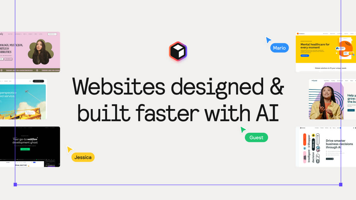
Relume is the cleanest illustration of this week's whole point. You describe what you're building in a sentence or two, and it generates a full sitemap and wireframe structure in about a minute — turning "how do I build this?" into "what should I build?" You're not staring at a blank page; you're reacting to a draft and ruling options out. Which is exactly the right way to use it: let it produce, you decide. The free plan covers one project with AI sitemap and wireframe basics — enough to feel how it works.
Free Knowledge
Nielsen Norman Group is more than two decades of research-backed, jargon-free writing on usability and information architecture — the gold standard for "design as function, not decoration." Start with anything on navigation or forms and you'll recognize the three questions in different clothes. No signup, no paywall on the articles. When you're auditing your own site this week and something feels off but you can't name it, this is where you go to name it.
Recommendations
📕 MGMT Playbook : Practical management insights straight to your inbox every Wednesday.
🏢 Retirepreneur : Your guide to turning decades of experience into profitable consulting, coaching, or course businesses, without risking your retirement security.
🗃 Dealroom Business Success Uncovered : Learn directly from billionaire entrepreneurs on how to grow a business. Join a community of 2,000+ innovators.
🧾 Redefining Retirement : Too Young to Retire, Too Old To Take Orders? Yeah, Me Too.
Visual Crapshoot


Help me help you: What's the #1 challenge holding back your late career side hustle?
- Financial risk management - can't bet retirement
- Worry that you're not tech savvy enough
- Have connections but unsure how to use them
- Business model selection confusion
- Time management with family obligations
- How to validate product while still employed
- Age discrimination concerns
- Is it too late for my idea?
- Other
Launch Key readers – thank you for your support and feedback. I appreciate each and every one of you as I work to build something you value.
Remember, if there's anything you'd like to share — a recommendation, a story idea, or just a note to say hi, hit the reply button and fire away.
